


1
2
3
4

Kawaiian Lion
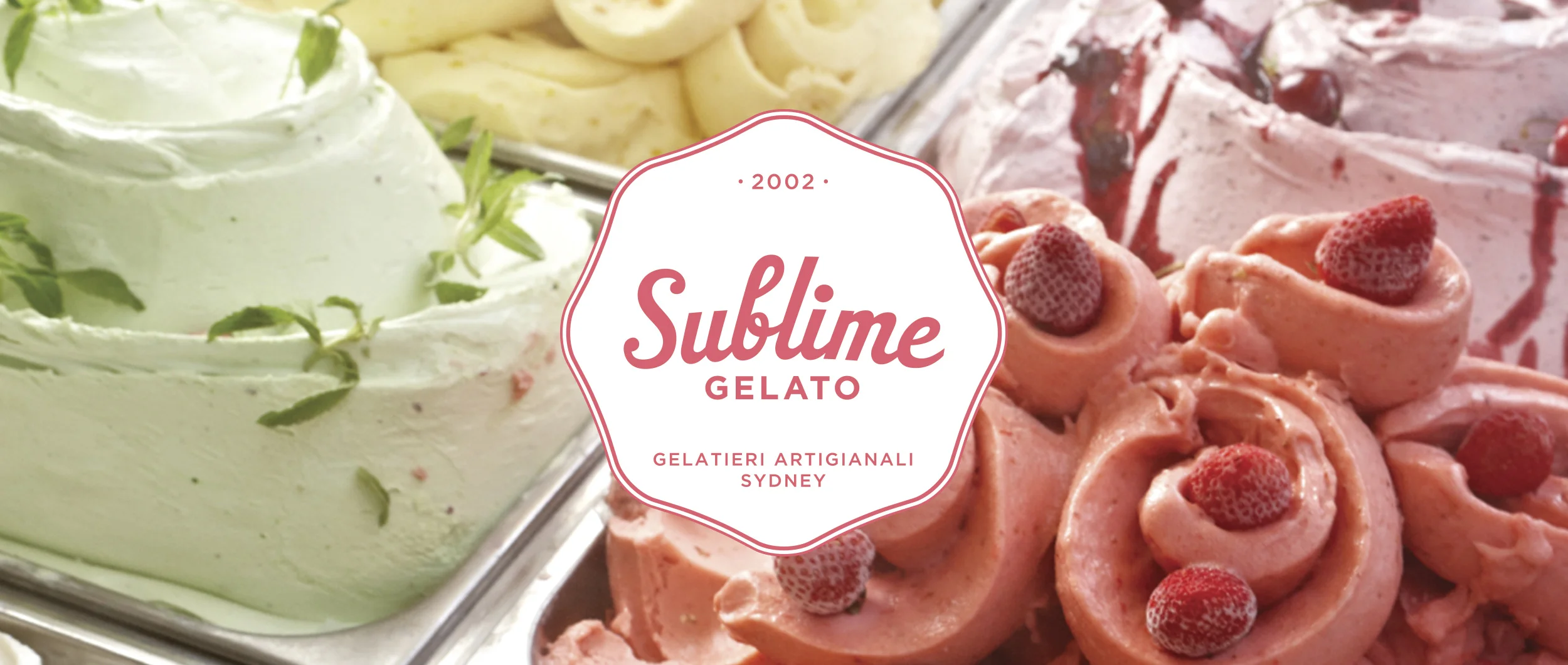
The idea behind the design for the logo was to create a summery, nostalgic and relaxed vibe. The inspiration for the logo was 80’s skate graphics. This can be seen reflected in the use of the circle, but also where the lettering and the imagery bleed into the circle.
Whilst needing a bold logo the identity also had to be flexible in that we needed to be able to strip it back to a more simplified graphic as it would need to be reproduced in small difficult spaces - such hang tape and other small and inconspicuous tags attached to the products.
The distressed screen-print treatment to the branding gives the overall hand-made, vintage, textured feel that is synonymous with the brand.